")
🎨 Introduction: When Material Color Speaks Louder Than Words
In packaging, color is more than a visual choice—it’s a psychological language.
Even before the logo or typography, customers subconsciously interpret the tone and texture of the box to form judgments about quality, sustainability, and brand personality.
The most fundamental color decision often lies between kraft brown and whiteboard white.
While both serve the same functional purpose, they evoke entirely different emotions.
Working with a skilled Cardboard Boxes Supplier can help you strategically choose which tone best supports your brand message.
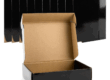
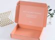
🧱 1. Kraft Paperboard: The Language of Authenticity and Sustainability
Kraft paperboard—with its natural brown hue and raw texture—immediately conveys simplicity and eco-consciousness.
It’s made from unbleached pulp, often recycled or FSC-certified, making it an ideal choice for sustainable and artisanal brands.
🌿 Psychological Associations
-
🌾 Natural & Honest: Appeals to consumers seeking authenticity.
-
🌍 Eco-Friendly: Symbolizes environmental awareness.
-
🪵 Tactile Warmth: Feels organic and handmade.
💡 Best For
-
Organic food or skincare.
-
Eco-lifestyle products.
-
Coffee, tea, or handmade goods.
💬 A kraft box doesn’t need loud graphics—its material is the message.
Brands often pair it with minimalist black or white typography for timeless elegance.
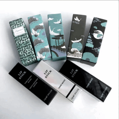
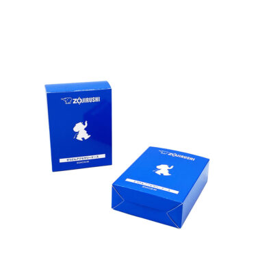
🧊 2. Whiteboard Paper: The Language of Purity and Precision
Whiteboard (coated or uncoated) represents clarity, cleanliness, and sophistication.
It’s often chosen for products where visual precision and high print fidelity are critical—such as cosmetics, electronics, or pharmaceuticals.
🎯 Psychological Associations
-
💎 Premium & Modern: Clean lines communicate quality and innovation.
-
⚪ Hygienic & Pure: Ideal for healthcare or beauty products.
-
🎨 Versatile Canvas: Allows vivid color printing and foil detailing.
💡 Best For
-
Luxury and tech brands.
-
Medical and wellness packaging.
-
Products emphasizing purity or innovation.
A whiteboard surface supports advanced finishes like foil stamping, spot UV, or embossing, delivering a crisp and premium aesthetic that kraft cannot replicate.
⚖️ 3. Comparing Brand Perception: Kraft vs Whiteboard
| Attribute | Kraft Packaging | Whiteboard Packaging |
|---|---|---|
| Brand Image | Natural, authentic, earthy | Modern, clean, premium |
| Texture Feel | Coarse, warm | Smooth, sleek |
| Print Capability | Limited color vibrancy | High-definition graphics |
| Sustainability Appeal | Strong | Moderate (bleaching may reduce eco score) |
| Consumer Expectation | Organic, ethical, handmade | Luxury, precise, scientific |
Choosing between the two is less about “better” or “worse”—and more about aligning with brand story and market positioning.
🧩 4. Hybrid Approaches: The Best of Both Worlds
Modern brands increasingly combine both materials for layered storytelling:
-
Kraft outer box + white inner sleeve: Rustic exterior with refined interior.
-
Whiteboard main body + kraft insert: Balances luxury with sustainability.
-
Printed faux-kraft finish on coated board: Achieves natural look with print flexibility.
Such hybrid constructions allow creative contrasts—ideal for unboxing experiences that surprise and delight.
Your Paper Boxes Manufacturer can advise on paper layering and coating combinations to achieve the exact tactile and visual balance your brand requires.
💚 5. Sustainability and Recycling Perception
Both kraft and whiteboard can be sustainable—but consumer perception often favors kraft for visible eco cues.
However, eco-performance depends on coatings and inks:
-
Uncoated kraft = 100% recyclable and compostable.
-
Whiteboard with aqueous coating = recyclable, but not compostable.
-
Laminated or foil-finished surfaces = recyclable only through specialized streams.
Transparency about material sourcing and recyclability helps reinforce your brand’s sustainability message, no matter which tone you choose.
🧠 6. Case Study: Coffee Brand’s Material Pivot
A specialty coffee roaster switched from glossy whiteboard cartons to natural kraft boxes with black soy ink printing.
Results after three months:
-
22% increase in customer perception of “eco-conscious” values.
-
17% boost in social media engagement.
-
Lower printing cost due to simplified single-color design.
The brand successfully repositioned itself from “premium gourmet” to “authentic sustainable” without changing its core price point.
💬 Conclusion: Let Your Material Tell the Brand Story
Material color is not just a design detail—it’s the first handshake between your brand and your audience.
-
Choose Kraft to convey honesty, warmth, and eco-values.
-
Choose Whiteboard to project sophistication, purity, and precision.
To make the right choice, consult a reliable Cardboard Boxes Supplier and coordinate printing and coating details with your Paper Boxes Manufacturer for a unified, emotionally resonant packaging experience.